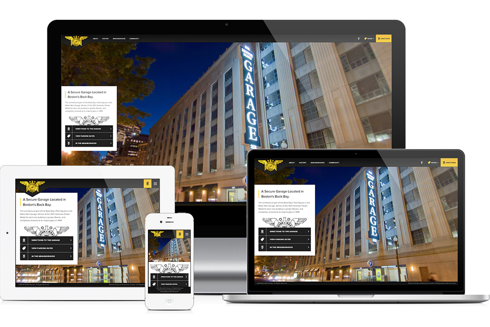
We are proud to announce that our website design for the Motor Mart Garage has been chosen as the “Web Pick of the Day” in Communication Arts. Communication Arts is one of the industry’s most respected publications for graphic designers, art directors, interactive designers, and every kind of designer involved in visual communication. Communication Arts showcases the most innovative designs in advertising, illustration, photography, interactive media and typography.
The two most important things a parking garage website needs to convey are where it is, and what the rates are. This site achieves that with prominent buttons and a very clean navigation system. Custom photography helped make this historic building in downtown Boston look clean, safe, and brightly lit. The website redesign is also fully responsive — with optimized views for tablets and mobile devices. Extra effort went into custom icon designs and floor plan illustrations.
Motor Mart is proud of it’s revolutionary in 1927 Double Threaded Helix ramp design, still rarely employed in large urban garages due to space constraints. Yet at the Motor Mart it allows patrons to rise two vertical levels while circling the garage only once, and combined with our Clearway Path travel lanes (no ramp parking), speeds vehicles directly to the nearest available space. Upon exiting, the Helix brings cars to either side of Park Square (Stuart St or Columbus Ave), wherever traffic is least. Check out the website redesign here.
