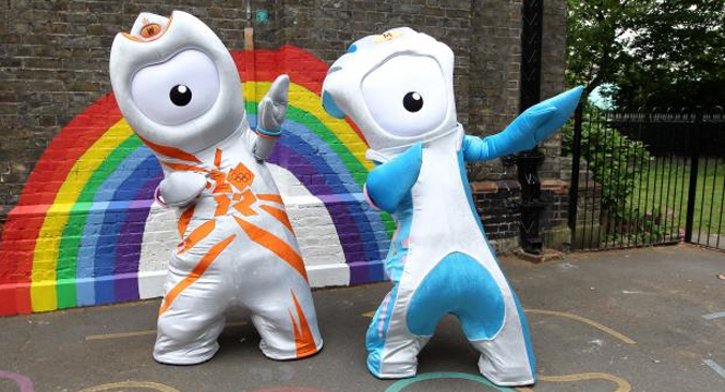
“As a designer we design things for target audiences, so my big question is, who is the target audience for these mascots? Looking at the videos online — it appears that it’s younger people, getting them excited about the Olympics. So the people who are upset about the design aren’t the target audience. . . . [The live mascots] are like these weird, fat stuffed things.
But if you look at the video and some of the background on the characters they’re actually kind of cool. There’s a whole story behind them. By the time 2012 rolls around moving media will be more accessible and the target audience will be seeing this as moving media. They’ll be seeing this as clips on their phones and whatever the next iPad is and computers in schools. I think these mascots need movement to work.
In the backstory they’re saying these guys are two little drops of metal that came to life, and they did beat all odds. They became these animated creatures when they were destined to be just part of the metal of the Olympic stadium. That’s a childlike approach to the feeling that the Olympics have. But as a stand-alone visual element, they don’t work. They need that story.” Read the full article: Designers grade the new Olympic mascots.
