MassKids: Enough Abuse
Enough Abuse is a citizen education and community mobilization initiative working to prevent child sexual abuse in our homes, schools, youth organizations and communities.
Project Services
- Sitemap & Wireframes
- Gutenberg Page Building
- Wordpress Development
- Custom Design Templates
- Research & Discovery
Empower change.
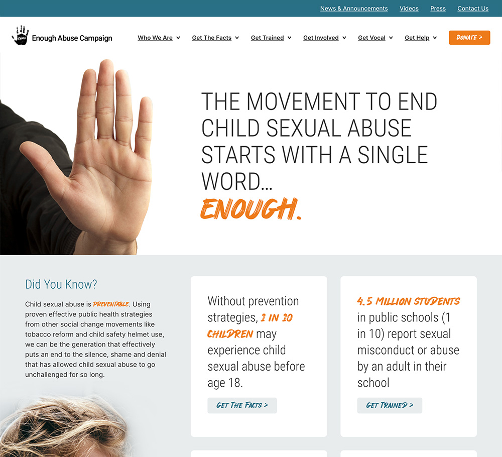
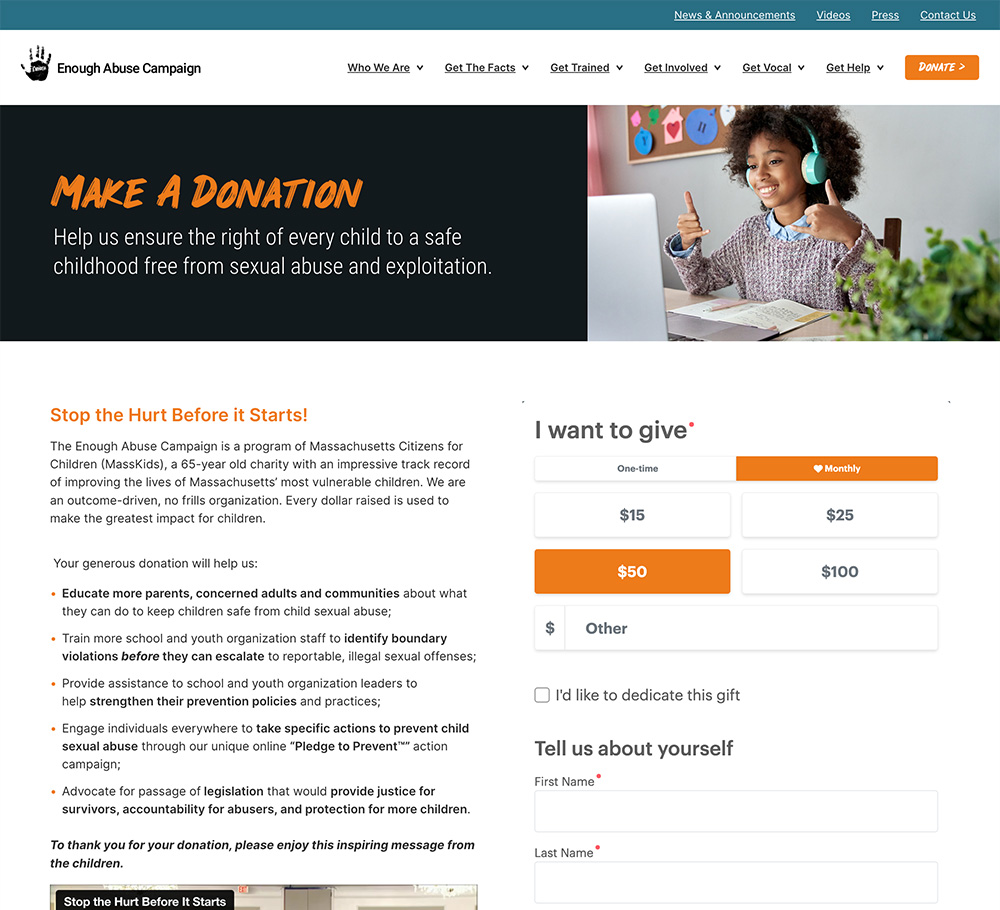
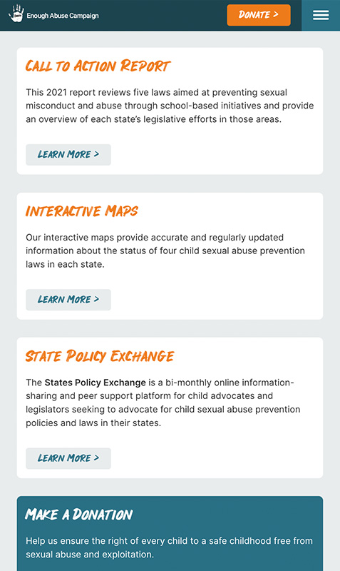
Enough Abuse empowers concerned citizens, survivors, parents, school and youth-serving professionals, and others to ensure the right of every child to a childhood free from the devastating and often lifelong consequences of child sexual abuse. The website uses the GeoMap interactive map tool to let users find local laws in each state. The donation page embeds the DonorPerfect tool which we styled to match the site.
The Metropolis Creative team did a wonderful job redesigning and developing our Enough Abuse website. They worked closely with us to ensure the site reflects our organization's mission to prevent child sexual abuse and clearly directs people the resources and information they need, while highlighting different aspects of our work. The updated site is engaging, clean and powerful and we are very proud of it. Metropolis Creative is a great team to work with!
Target Audiences
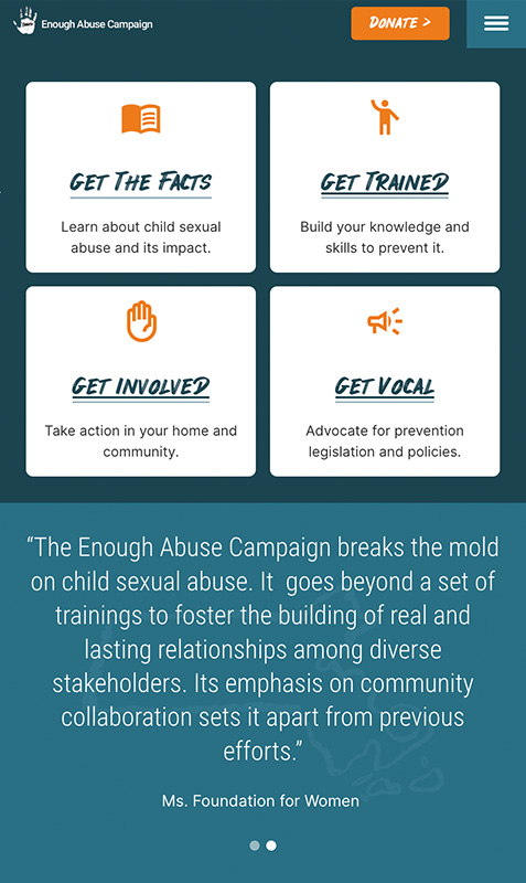
Our main goal with the redesign was to be able to target different groups with specific messaging. Enough Abuse targets educators, legislators, health and social workers, potential volunteers, and donors, as well as victims.
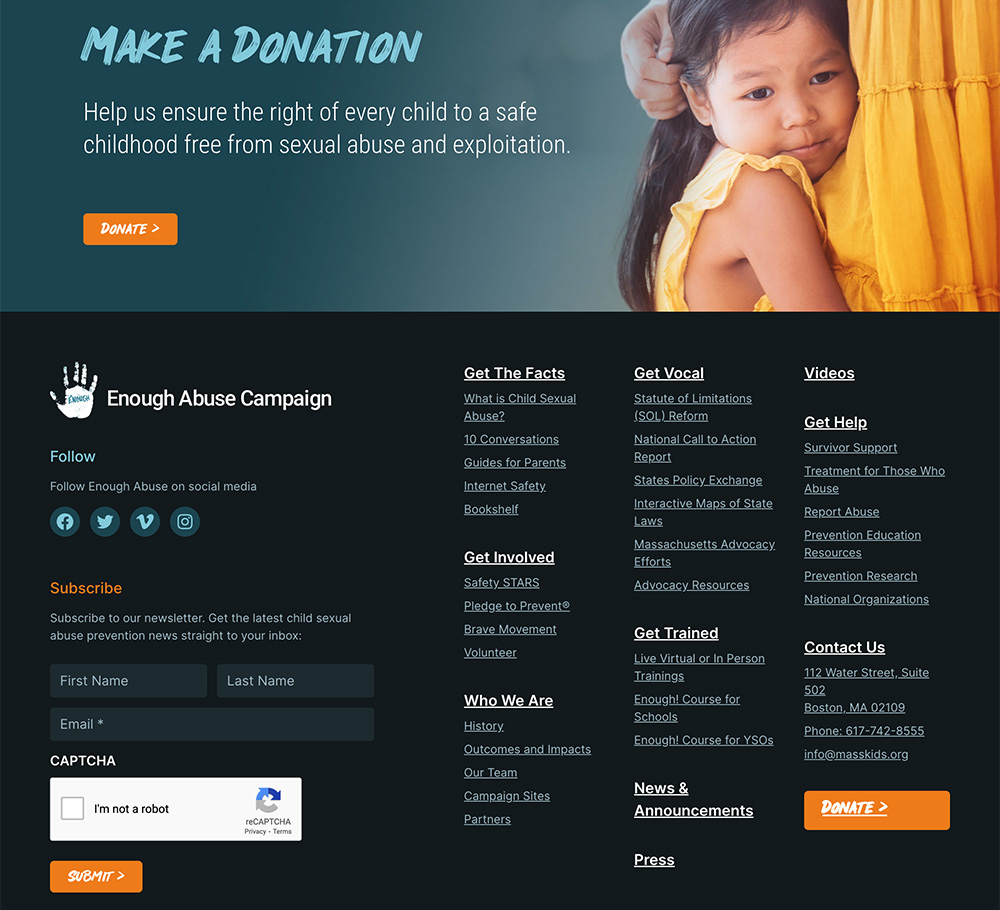
Online Donations
The donation page uses a third-party donation tool for those ready to donate now. We matched the colors and styles as much as the tool allowed to make it feel integrated with the site. Other options, and audiences, are addressed further down the page.
Interactive Maps
This tool allows users to easily find the local laws mandating or Allowing Child Sexual Abuse Prevention Education in Schools. As of January 2023, 28 states and D.C. have passed legislation mandating instruction within schools on child sexual abuse awareness and prevention. Eight states have passed legislation allowing or recommending this kind of instruction. Fourteen states have no laws in place at all.
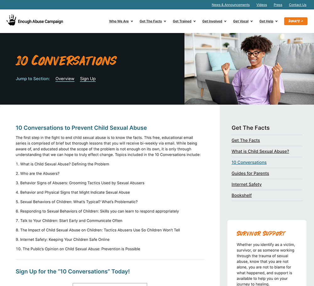
Every website design starts with a set of wireframes to help us better understand what content is needed on each page. A good page design should tell a story in the right order. Size and position help set the hierarchy of how the content will be consumed. The bulk of the site’s structure happens in these blueprints before we move on to the color design mockups.


The Results
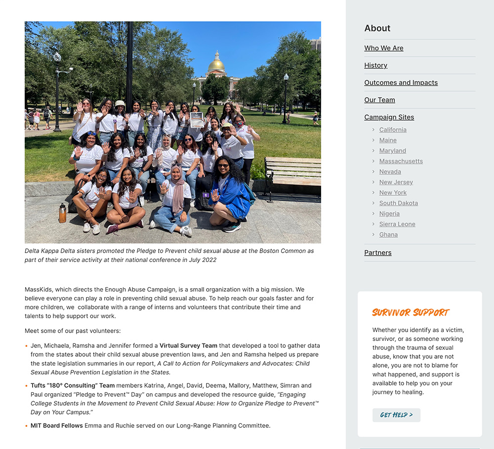
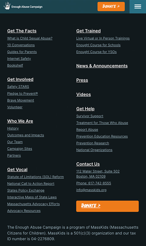
The revamped Enough Abuse website now has a modern appearance that displays beautifully on any device. The updated navigation now presents the large volume of inside pages in an intuitive way that is super easy to navigate. Users are guided through to the content that is most important to them, ultimately leading to custom calls-to-action.

Interested in starting a project?
Tell us a little (or a lot) about what you’re looking for. We can answer any questions you have about our process, timing, and recommended next steps.
